
As soon as Vegas announced that their expansion hockey team would be named the Golden Knights and the logo was first unveiled on November 22, 2016, mocks of what their jersey design may be started to pop up across the internet.
Since the official jerseys were unveiled on June 20, 2017, it has been fun to go back and look at some of the mock ups that we still like better, and some that now seem ridiculous.
One particular mock up that should be appreciated is the one done by Ohio State University student Avi Stein. The Graphic Design student almost perfectly predicted what the Vegas jerseys would look like and posted his mock-up online back in December, over six months before the official unveiling. Check it out.
Stein’s mock-up, posted December 16, 2016:
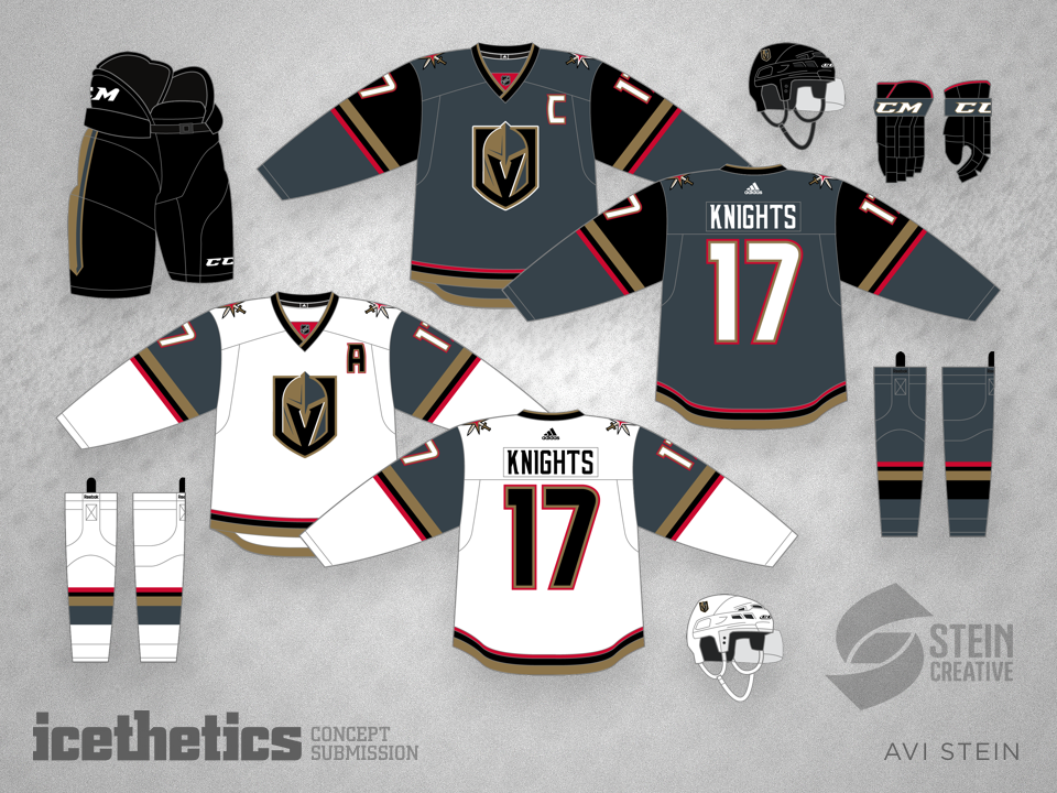
The golden armband on the official jersey is thicker than Stein’s version, and there’s no red stripe around the waist, but otherwise it looks pretty good.
While there were concept jerseys fans liked better than the final product, sometimes the best bet is the safest, and that's the one Stein made back in 2016.
(H/T: /r/hockey, icethetics)


