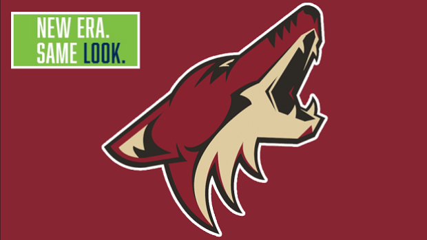
Last night, the Minnesota Timberwolves revealed a new logo to announce a new era in their team history – but the Coyotes feel it looks a lot like an already existing era, in Arizona.
The new logo leaked yesterday but was eventually unveiled at halftime of the team’s game against the Thunder. There were mixed reviews based on the colours, familiar circular look (It has been a very popular style in the NBA) and change of direction from the snarling wolf of the past.
The Coyotes are the latest team to give their opinion, and they’re fans, but probably not for the reasons that the Timberwolves would like.
The howling wolf/coyote is very similar and the Coyotes have used a circle behind their logo in the past as well. Here’s the Timberwolves logo for comparison.
Let us know your thoughts on the new logo and it’s similarities to the Coyotes’ logo @BarDown.


