
The NHL regular season is just around the corner and 31 teams will be rocking the new Adidas uniforms come October. While some organizations saw their sweaters experience minimal changes, others went through quite the overhaul.
The Edmonton Oilers will be one of the few teams with a relatively different look in 2017-18. The new jerseys will feature a different line pattern and darker blue.

NHL.com
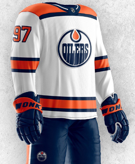
Graphic artist Dylan Nowak decided to take the new design into his own hands, and added a few new details to both the home, and away jerseys. Take a look.
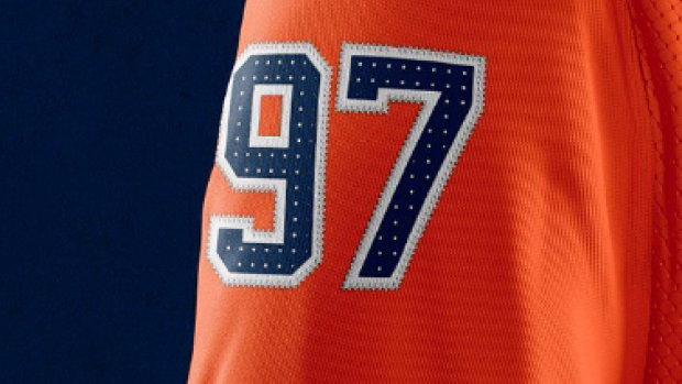
The home jersey doesn’t appear to be much different, as the only glaring differences is that the white stipe across the front doesn't run around the shoulders. But if you take a closer look at the numbers, you can see that Nowak also added white dots on the numbers.
Not a bad addition. You’ll notice that the white jersey is the real unique one of the two, as the artist decided to stick to thicker line patterns rather than the original thinner ones. Additionally, the shoulders are bright orange rather than the new blue.
You can add these bad boys to the list of Oilers jerseys created in recent years. We’ve got to say though, it would be great to see a new concept made with this old logo.

Nowak’s work has recently appeared on BarDown, including his own takes on the Toronto Maple Leafs and Anaheim Ducks jerseys. He recently released a concept that specifically caught our attention.
What a beauty.
Nowak has now done jerseys for the Oilers, Leafs, Senators and Canucks, so us Canadian hockey fans are just waiting for the remaining three to be released.
So far, so good.
(H/T Dylan Nowak Art)


