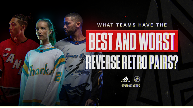
After the inaugural class of Reverse Retro jerseys took the hockey world by storm (for both good and bad reasons), Adidas decided to run it back this year, bringing an entirely new slate of 32 jerseys to the table.
With almost every team, aside from Seattle, adding another design to their jersey repertoire, the conversation surrounding jersey design and a team’s on-ice look were once again brought to the forefront of the sport.
Some teams seemed to learn from their previous mistakes, bringing back iconic logos that countless fans had asked for.
From the Boston Bruins bringing back the Pooh bear look, to the New York Islanders finally caving and resurrecting the fisherman logo, some teams embraced the term “retro” and fully committed to the idea.
Other teams fell well short of the mark. I’ll save those for the actual list.
Now that there are officially two renditions of the Reverse Retro line, we can finally elevate the conversation behind what teams have the best jersey designs.
Gone are the days of simple power rankings and tier lists. It’s now about what teams can say they have the best Reverse Retro pairings overall.
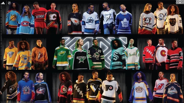
So, without further ado, let’s see if you’d be proud to rock both of your team’s designs. Or if you’d simply ignore both.
THE BEST
Tampa Bay Lightning: This is a perfect example of a team that tries two different things each year and hits both attempts out of the park. In their first jersey, the Lightning elected to pay homage to their 2004 Stanley Cup winning team, bringing back the vintage logo that they wore when they hoisted their first championship.
Mix in their updated blue base from today’s modern-day franchise, and you have a sleek design that combines both retro and current vibes into one jersey.
For round 2, the Lightning decided to go bolder. Much like the Anaheim Ducks’ first edition Reverse Retro, Tampa incorporated some animated parts into this jersey, as it features rain, lightning and the sea in full sized graphics throughout the design.
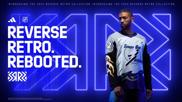
Adding their 2004 logo along with an electrified-looking font and you have an absolutely wild, yet incredibly creative, jersey.
Full marks to Tampa for going all out with this one.
It might not be everyone’s favourite at first, but I’m confident it’ll age like fine wine. At the end of the day, who wouldn’t want to own a jersey that looks like a comic book?
With both concepts achieving completely different results, the Lightning have a great balance across both their Reverse Retro designs. Fans have a lot to choose from (and a lot to like) and they really can’t go wrong with either.
San Jose Sharks: The Sharks have been incorporating creativity into their organization since they first came into the league. As a California expansion team, they put themselves on the map the second they entered the NHL.
Even though their logo has gone through some facelifts since the 90s, the first edition of their Reverse Retro honours their expansion history. With their original third jersey logo making a return, the Sharks embraced the “retro” feel of the design, while adding modern-day teal and white accents. A simple and nostalgic look with hints towards the present.
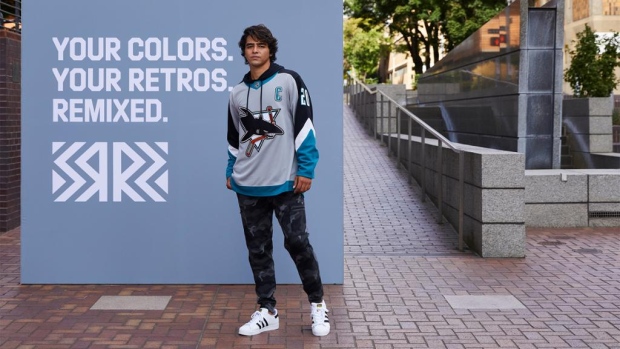
In 2022, the Sharks turned the clock back even further, and went with a wordmark logo as opposed to a graphic. They also spun it into the original colours of the California Golden Seals, California’s original NHL franchise, which gives this latest Sharks jersey quite the unique twist.
Now, I think I would’ve preferred their iconic logo of a shark biting through a stick in the colours of the California Golden Seals, but the lettering of the word “Sharks” is arguably just as cool. Not only that, the Golden Seals jerseys were iconic for a reason, and it’s great to see a current franchise incorporating that vintage design back into today’s NHL.
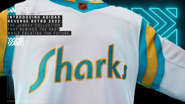
Much like the Lightning, the Sharks definitely have an effective balance of alternate jerseys to choose from, which is why their Reverse Retro set is one of the best in the league.
The Shark logo? Iconic. The California Golden Seals? Iconic. The team may not be great on the ice, but at least they’ll look cool.
St. Louis Blues: The Blues went absolutely crazy for both their Reverse Retro designs. Their first attempt is not only a nod to the tarp that some of their most iconic players wore (Wayne Gretzky, Brett Hull and Chris Pronger to name a few) but they also swapped the primary colours, putting the word “Reverse” in “Reverse Retros”.
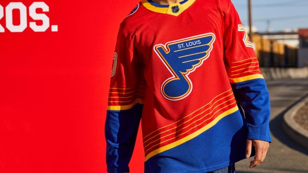
If you thought that swapping out the primary colours of a jersey was crazy, just wait until you hear the breakdown behind their second edition.
Inspired by the Winter Classic jerseys from both 2017 and 2022, the Blues modernized one of the team’s original jersey prototypes from 1966. A prototype only worn by members of the original ownership group a full year before St. Louis even hit the ice.
I wonder if any of the original prototypes are still intact…
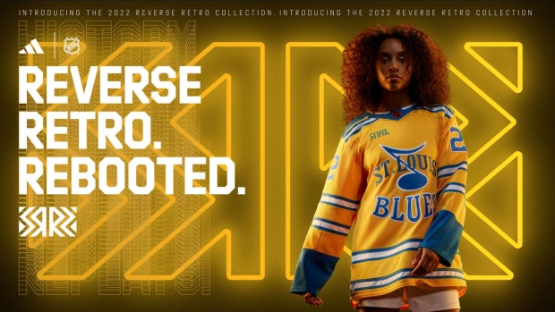
Either way, St. Louis can undoubtedly say that they have two of nicest Reverse Retro designs, for in terms of appearance and historical significance.
Honourable Mentions
Los Angeles Kings: There’s just something about the classic purple of Los Angeles that makes any jersey pop. In 2021, the Kings dipped back into the 1990s and brought back one of their best logos yet.
For round two, LA went back even further, resurrecting their 1982 “Crown” logo.
To put a long story short, purple and gold will always belong to Los Angeles and seeing those colours continuously incorporated into hockey jerseys is something that fans will never get tired of.
Pittsburgh Penguins: The Penguins brought back their diagonal wordmark logo in their first attempt at a Reverse Retro. A simplistic and modernized design, that jersey was nice on its own.
The return of “Robo-penguin” for their second attempt puts their Reverse Retro set over the top.
Vancouver Canucks: Vancouver definitely improved on their first attempt at a jersey gradient with their first Reverse Retro design. Making the lumberjack a primary logo puts their second design among the best in the league.
Simple math dictates that they now have one of the cleanest pairings.
THE WORST
Detroit Red Wings: Was this even a debate? Detroit didn’t even look like they tried last year, since somebody thought that mixing white and gray together would look cool.
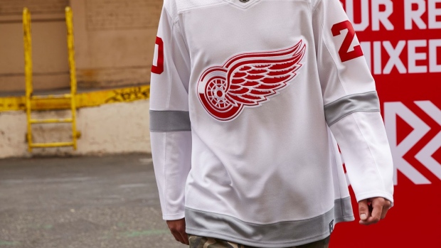
While that jersey suffered the wrath of fans around the hockey landscape, being dubbed a “practice jersey” with the design falling well short of the mark, this year was unfortunately more of the same.
The Red Wings tried to do something different, but it still doesn’t save them from having one of the worst Reverse Retro pairs among all the teams. Drawing inspiration from the Detroit Cougars team of the 1920s, the Red Wings incorporated the colour black into their jersey design for the first time in franchise history.
The result? A poorly executed, confusing jersey design.
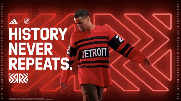
Now, this jersey is better than their original Reverse Retro, simply by default. But it’s not that much better. For a team with so much history, it’s a little odd to see them not try something a little more fresh.
My suggestion: put an octopus on a jersey.
Chicago Blackhawks: The Blackhawks find themselves in the same category as Detroit. The first edition of their Reverse Retros actually weren’t as bad, though, as they were a nod to a logo worn from 1937-55.
It’s their second kick at the can that is shockingly disappointing. Sometimes, wordmark jerseys work really well and bring a fresh and exciting look to a team’s lineup of jerseys. For Chicago, that couldn’t be further from the truth.
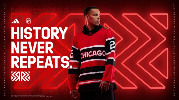
It’s a classic case of “you can copy my homework, just don’t make it look exactly the same” (we’re looking at you, Detroit).
In all honesty, if you squint your eyes just enough, you wouldn’t be able to tell if it’s the Red Wings or Blackhawks jersey you’re looking at.
And for that, this is among the worst pairings of the Reverse Retro line.
Philadelphia Flyers: Last but certainly not least are the Philadelphia Flyers. Now, there is nothing objectively wrong with either of Philly’s attempts at a Reverse Retro. There are no major jersey fouls or any questionable design choices.
They’re just boring. Both of them.
The Flyers’ original Reverse Retro doesn’t look all that different from their regular home jerseys. A slight change in the shade of orange seems like the only notable difference.
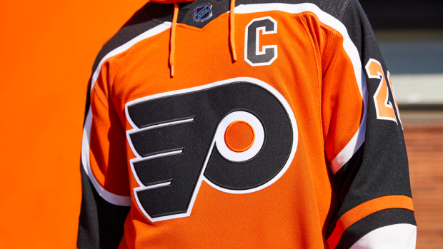
Their 2.0 designs were more of the same. Swap out the orange for a white base and you have the exact same design. I won’t even bother attaching a photo since you can probably picture what that looks like.
Two boring jerseys. Two jerseys that are somehow deemed as Reverse Retros. I wish I could say it gets better for Flyers fans.
A LOOK TOWARDS THE FUTURE
At the end of the day, the second edition of the Reverse Retro line will bring some exciting new concepts to the ice for the 2022-23 season. Some teams continued to hit their concepts out of the park while others struggled to bring a compelling design to the table.
Either way, it’s safe to say that the Reverse Retro lineup continues to make a monumental impact within the hockey landscape.
What teams can say they have the best set of Reverse Retro jerseys? Let us know, @BarDown.
