Yeah, yeah, yeah... Playoffs, season openers, draft day... there are a lot of days on the hockey calendar that get hockey fans going each and every year.
In 2022, we have another one: Reverse Retro jersey drop day!
After last year's 'Reverse Retro' jerseys took the hockey world by storm, cleverly combining undying nostalgia with new-age looks, Adidas Hockey decided to do it again.
Last year, there were some absolute fire jerseys. The Colorado Avalanche's nod to the Quebec Nordiques, the Vancouver Canucks bringing back the flying skate, and the Calgary Flames "Blasty" jersey to name a few.
There were also some duds, like the Devils labeling their Jersey as "Jersey," the Flyers not taking much of a chance, and the Wings, well, breaking out the practice jerseys?
Similiarly, this year's drop brought a wide range of emotions. While fans were thrilled to see the Islanders fisherman return, the Robo-Penguin ressurect, and the Sharks sharing a nod to the ever-popular (and hilariously ugly) California Golden Seals colours, others didn't do so well.
Luca, Corwin, Jesse, and DZ decided to go through each of the jerseys and create a tier-list out of them. Alongside analysis on the jerseys themselves, Luca provides us with some interesting details that may not be seen upon first glance.
SWIPE THROUGH:
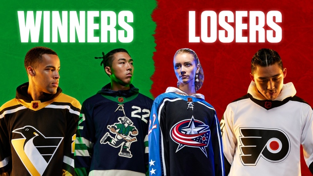
While opinions differ from person to person, there are some teams that we can define as the overall 'winners' and the overall 'losers.'
WINNERS:
New York Islanders: Bringing back the fisherman logo is like a cheat code into hockey fan's hearts. While some people think it's an ugly logo (such as our guy DZ), the fisherman is such a cult hero in the NHL jersey landscape that it's sure to, shall we say, make some waves.
San Jose Sharks: While the colours are objectively ugly as they shamelessly clash together, the nod to the California Golden Seals is impossible to hate on. Anyone who has had the opportunity to play as the Seals in an NHL video game has no doubt taken the opportunity.
Florida Panthers: Everyone seems to be under the same interpretation of the Panthers Reverse Retro; even if they don't like the design, the really respect that the Panthers "went for it." That's more than some teams can say...
Pittsburgh Penguins: Robo-Penguin is back. Enough said.
New York Rangers: The Rangers brought back Lady Liberty, as they did last year, but this time they did it right. They modernized the jersey by adding the current colourway, perfectly walking the line between "Retro" and "Current."
Vancouver Canucks: Speaking of the cult favouritism that comes with the Isles' fisherman logo, Johnny Canuck is a character that Canucks fans have always adored. The Canucks nailed it with the flying skate last year, and they nailed it again this year while going in a wildly different direction.
Washington Capitals: Not much to analyze here, the screaming eagle is just an awesome logo. You can't see it without thinking of Peter Bondra, Olaf Kolzig, and the Capitals team that made it to the Stanley Cup Final back in the late 90s, only to lose to the Red Wings. Speaking of the Red Wings...
Boston Bruins: The Pooh Bear logo is an absolute classic. It's actually one of the first 3rd jersey logos to every exist, and while some think that the detailed bear image is a little much for a jersey, we love what they've done with the rest of the tarp. Looking CLEAN.
Calgary Flames: Black jersey with the white flaming 'C' is an awesome look. The janky line work at the bottom may turn off some, but for us it's just a reminder of the early Jarome Iginla days. The textures in the 'C' are likely the best textures of the drop, and the jerseys simply pop.
L.A. Kings: The Kings have so much to work with in terms of classic looks, and they didn't miss with this one. The purple and gold is a fan favourite, and the old school crown logo is the cherry on top.
LOSERS:
Detroit Red Wings: The Wings were the unanimous losers of last year's jersey drop, and while they may not have the worst jerseys of this year's crop, they're still in the 'L' category. Teams with so much history and so little variance in jersey design have little to work with in the Reverse Retro concepts, but the Wings essentially just ended up looking like the Chicago Blackhawks.
Chicago Blackhawks: This should really just be the same category as the Red Wings. If the 'Hawks really wanted to make a splash, maybe they should have brought back the front-of-jersey football-style numbers.
Columbus Blue Jackets: This looks a little like a generic jersey you could buy at Wal-Mart. Overall, the Blue Jackets seem to have more to work with than what they produced, so unfortunately that keeps them in the losers category... just like on the ice so far this year. Sorry, Columbus!
Philadelphia Flyers: The Flyers announced that they would be warming up in classic Cooperall pants, which is actually a huge bonus to their Retro Reverse release day, but overall their jersey is just boring. A lot of white space, no chances taken, and the same logo as it's always been.
Seattle Kraken: With only one year of history to work with, the Kraken could have taken a page from the Golden Knights and established a new look. Instead, they went with the same gigantic blue 'S' logo and a busy horizontal line scheme. Feels like a missed opportunity.
Carolina Hurricanes: The 'Canes seem to be caught in purgatory when it comes to jersey designs. They have three looks, and they essentially just rotate between them. We can't fault the designers, as the 'retro' look needs to go off something, but we've essentially seen this jersey before. Nobody sees this jersey and thinks "I must have it!"
JURY IS STILL OUT:
There are also a handful of jerseys that are liked by some, disliked by others, and may need to be seen in action before a final verdict is reached.
Tampa Bay Lightning: Wow. What an insane jersey! Overall, they're kind of ugly, but it's so 'out there' that it almost makes us love them? The rain, the lightning on the sleeves, the waves, the font... it all combines together to make one of the busiest jerseys we've ever seen.
New Jersey Devils: After the notorious "Jersey" jerseys, New Jersey paid homage to the Colorado Rockies colourway in a much cleaner edition. Overall, they look pretty nice, but some fans still aren't convinced.
Colorado Avalanche: The Avs were one of the undisputed "winners" of last year's drop, combining the Nordiques logo with the deep maroon of the Avalanche to create an absolutely beautiful tarp. Now, they went a wildly different direction by also paying homage to the Rockies. While it won't get the same love as last years, fans may come to like these retros.
St. Louis Blues: Going full yellow, the Blues certainly took a creative idea and ran with it. The font is a little offputting, but the musical note is a funky shape. Overall, we think we like it?
Edmonton Oilers: A classic logo, with the mechanical oil drop resurfacing in Edmonton. The big difference; the drop is orange? While the colour scheme may not be as aesthetically pleasing, bringing back the logo seems like a win.
Who do you think won and lost the jersey drop? Let us know @BarDown!


