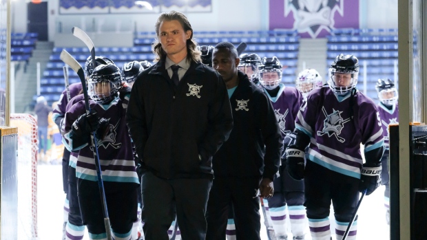
The new Mighty Ducks series is now out and with it comes yet another new Mighty Ducks logo.
We got a sneak peak of it ahead of the show’s release, and now the cat (or duck?) is out of the bag. We know you’re anxious to see it by this point so without further ado, here it is:
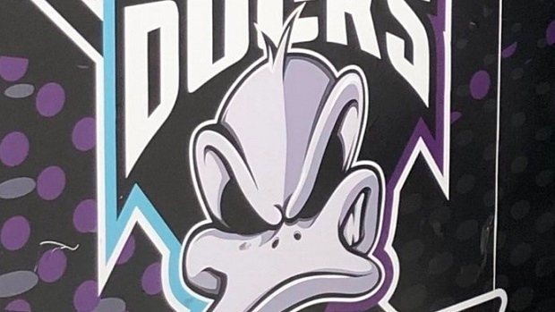
Not bad, right? Definitely creative and incorporates some aspects from the original logo, but it obviously doesn’t stand as the best. So.. where does it rank amongst all Ducks logos ever made? We’re about to determine the list once and for all, and feel free to either agree or disagree.
2006 – 2014
With all due respect to the Ducks organization… this has got to be one of the worst logos in NHL history, especially when you consider what it came after. Just brutal marks for this one all around and it’s really a shame that the team didn’t win its first Stanley Cup in franchise history the year before.
2003/04 – 2005/06
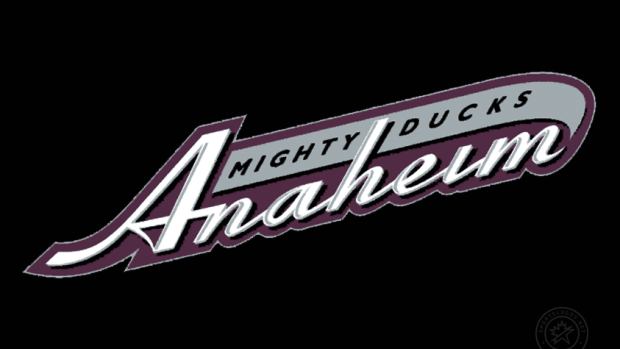
Again, not the organization’s finest work with this one. The hand-writing his cool and all but it just looks so basic and realistically belonged on the front of a baseball jersey. No thank you.
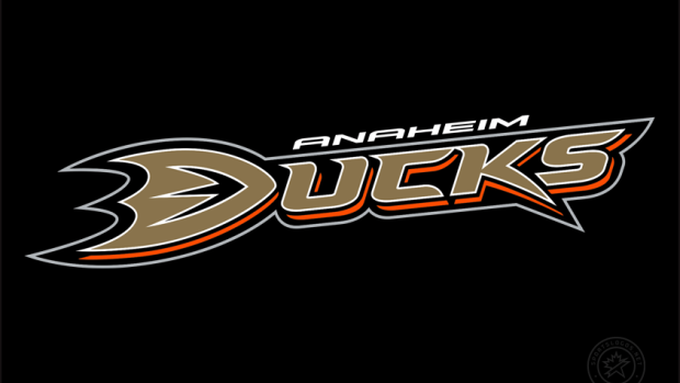
2010/11 – PRESENT
The Ducks’ current logo is pretty meh. Well, sorry. The logo is alright but the jerseys are pretty whatever. At least it helped get rid of the one from 2006-14… it still doesn’t even sniff our first three logos.
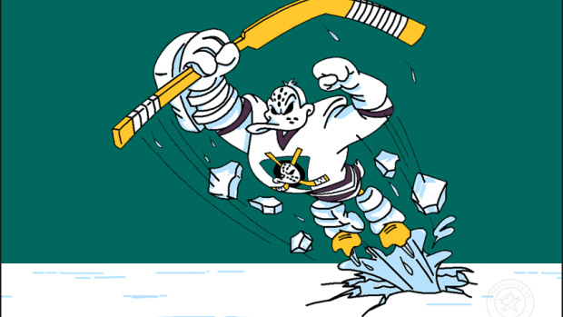
NEW MIGHTY DUCKS LOGO
Yup, this one belongs in the top three. Sure, it definitely doesn’t look like an NHL logo but at least it’s fun and creative (unlike the ones mentioned above ^). We love the duck face, too. Well done to the designers on this one!
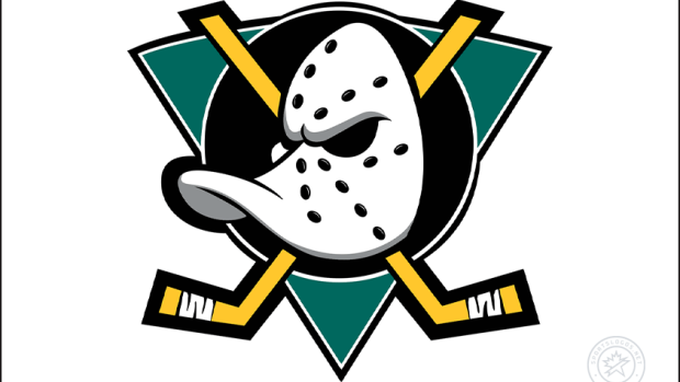
1995-96, PRESENT
Oh BABY. One of the underappreciated logos in NHL history, we’re sure glad the organization decided to bring this one back. The creativity is off the chart and it will NEVER get old.The new one obviously just has a different colour pattern but the logo is primarily the same.
Ducks, don’t ever get rid of this one again.
AND YOU GUESSED IT…
The OG
Like this wasn’t going to be number one. Greatest logo in franchise, and NHL history don’t @ us. It’s been used on different colour jerseys but we all know the white, purple and green colour pattern will forever be the GOAT.
BRING BACK THE ORIGINALS, BABY!!!!
So, these are our rankings. What does your list look like? Let us know @BarDown!


