The Hartford Whalers logo is undoubtedly one of the most iconic the NHL has ever seen, and it took some adjusting to get it just right.
Super 70s Sports released a series of Peter Good's original drawings of the logo and as you're about to see, it was just a few sketches away from looking completely different. Originally, Good did not have the whale tail hovering over the W. But can we all agree that it looks WAY better with it?!
Someone crank Brass Bonanza ASAP!
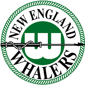
Good's inspiration (well, kind of) came from the New England Whalers, who played in the WHA from 1972-79. The old logo included a W with a harpoon (a weapon used to kill whales), so the artist ditched it in order to make the logo more harmless.
The following is an excerpt from sportslogos.net:
“There’s a conflict with using harpoons and your mascot is a whale,” Good said. “Harpoons are symbolic of killing whales, so you’re really expressing the idea of killing your own mascot. So I said, let me see if I can do something more positive.
He later continued:
I did a version, it had the negative H in the W, but instead of the whale’s tail, it had harpoons working with it. And [team owner] Howard Baldwin actually chose it. He said ‘I like that one.’ I said ‘Why do you like that one?’ He said, ‘Because it has the H for Hartford,’ and I said, ‘Wait a minute. That was not a requirement. That was just one that I tried. Now that I know that, give me some more time.’
In the end, everything worked out. The Whalers were nothing to write home about on the ice, but they did possess one of the greatest logos the league has ever seen. Sorry* sports has ever seen!
Well done Mr. Good.
(H/T Super 70s Sports)


