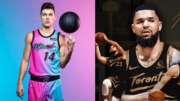
One of the more exciting NBA traditions we get every year are the release of the City Edition jerseys around the league, when teams embrace their creative side with new jerseys paying homage to their home cities.
As a result, we’ve seen some incredibly creative jerseys... as well as some notable misfires, which, honestly, people might look forward to as much as the good ones. Good news: This year’s crop of jerseys is strong overall, and the best ones are seriously amazing.
Over the last month, all 30 of this year’s City Edition jerseys have been unveiled by their teams, so let’s run through this year’s new threads in the way we know best. We ranked them.
30. Oklahoma City Thunder
Somebody had to have this year’s worst jersey, although let’s just note that these aren’t as bad as, say, the Mavs’ gradient jerseys with graffiti font and neon green trim last season. (Seriously.) The attempt at asymmetry on this jersey is honestly appreciated, although it’s just too bad that the whole thing just looks like an interstate gas station.
29. Los Angeles Clippers
Unfortunately, the Clippers have decided to bring back last season’s so-called Grand Theft Auto jerseys, this time in black. They weren’t too well-received last year, and we aren’t huge on them this year either.
28. Boston Celtics
The Celtics’ regular jerseys are timeless classics, which can make it hard to improve upon. This year, they decided to bypass the crazy font choices that doomed last year’s City jersey, but unfortunately, what they ended up with is the NBA uniform equivalent of the ‘IT IS YOUR BIRTHDAY.’ sign from The Office. IT IS THE BOSTON CELTICS.
27. Cleveland Cavaliers
These would’ve been last by a mile, until it was pointed out to us that the lettering on the jersey comes from the logos of classic rock bands and artists including David Bowie, Metallica and NWA. It’s a pretty cool homage! Unfortunately, it doesn’t do much about the fact that the Cavs basically hit themselves with the Spongebob meme. Folks, YoUr 2020-21 ClEvElAnD cAvAlIeRs!
26. Sacramento Kings
This colour combination... Why?!
25. Charlotte Hornets
Oh, we want to like these so bad. On paper, the mint base, pinstripes and gold trim are all things that we like. The execution just ain’t right, but WE REALLY, TRULY WANT TO LIKE THESE.
24. Washington Wizards
The stars and stripes side trim is a fun little quirk, but we’ve seen it from the Wiz before. This is literally last year's City Edition jersey, but just with a grey base instead of white. (The grey is also harshing our vibe.)
23. New York Knicks
We like what the Knicks are trying to do here, with the gradient side trim and a circular front logo, but that text is absolutely going to hurt our eyes.
22. Dallas Mavericks
Sleek design and points for genuine creativity, but we’re not so sure that they’ll work on a basketball court. Not to say anything of Kristaps Porzingis’ game, but these jerseys just scream ‘soft inside presence.’
21. Golden State Warriors
The Warriors are bringing back a classic from the We Believe era! These would honestly rank much higher on aesthetic merit alone, but the decision to go with the ‘Oakland’ wordmark is thorny after the Warriors made the move from Oakland to San Francisco last year — a move that didn’t sit too well with locals.
20. Philadelphia 76ers
These next few are mostly inoffensive, if a little boring. There’s some fun design stuff going on in this jersey, including a neat little reference to the 76ers’ old ‘Trust the Process’ slogan, but for the most part it doesn’t really pop visually.
19. Detroit Pistons
This style of circle logo is interesting, because it has a really pleasing minimalism that works, but on its own doesn’t do enough to make a jersey good either. It was a great look on the Indiana Pacers, but here, we’re just a little underwhelmed.
18. Minnesota Timberwolves
Brought to you by the Dallas Stars!
17. Houston Rockets
An all-blue look for the Houston Rockets is neat, and it’s a nice local homage to the city’s former NFL team, the Houston Oilers. As you’ll see, though, the Milwaukee Bucks are going with a better version of this jersey this year.
16. Orlando Magic
The Orlando Magic’s pivot to orange was weird last year, and it took some time for us to adjust. We’ve adjusted! This minimal white jersey with orange pinstripes feels very much like an appropriate median point for this year’s City Jersey rankings. It’s a nice jersey!
15. Los Angeles Lakers
Alright, here’s where keeping things minimal really begins to work. The Lakers didn’t do too much, and they don’t have to. This is just a pleasing redesign of their traditional jerseys with a nod to Minneapolis Lakers baby blue, from the pre-L.A. dynasty years.
14. Toronto Raptors
Is it a hot take around these parts to say that the gold-based OVO look is becoming a bit tired? Just in general, gold isn’t a look that seems to work well often on jerseys, with an exception to the NHL’s Buffalo Sabres. The throwback wordmark is appreciated here, as well as the claw mark across the shorts. Asymmetry wins again.
13. Atlanta Hawks
The Hawks kept it as simple as anyone, but an MLK jersey scores major points regardless of any other design elements.
12. Chicago Bulls
Now here is some inspired font selection. That lettering is a homage to Chicago's art deco style, and it absolutely pops on a jersey. Shout out to the Bulls!
11. Milwaukee Bucks
See, we told you! This Bucks jersey is basically the Rockets' City jersey, but with a literal swerve thrown in. These are going to pop and look great from far away AND from up close.
10. Brooklyn Nets
This might be controversial placement, since these jerseys are already taking some heat for the Rugrats font and childish design elements. To that, we say: Loosen up! This is wacky, and fun, and also, a Basquiat homage. It’s literally a high-art jersey that doesn’t take itself too seriously. How does it miss?!
9. Denver Nuggets
The Nuggets have been winners over the last few years with their rainbow skyline jersey, which might have left you wondering how they would follow it up. Doing the design over in an all-red look comes out of left field, and let us tell you, it BANGS.
8. Utah Jazz
Like the Nuggets, the Jazz are sticking with their design of the last few years but adding a neat colour swerve, this time with a fade to black on their gradient jerseys. It’s a nice little spin on what remains one of the most unique jerseys in sports.
7. New Orleans Pelicans
This one might be controversial too, since it honestly is such a weird jersey. Around these parts, we like to reward weirdness, and this design after the New Orleans city flag is one hundred percent going to work on a basketball court.
6. Indiana Pacers
WHEW. THE PINSTRIPES ARE BACK. Points to the Pacers for going with bright colours and letting these things pop, too. We are over muted colour palettes in 2020!
5. Miami Heat
Last year’s baby-blue Vice City jersey from the Miami Heat was supposed to be their last, but they decided to bring it back last minute with a bizarro gradient look that’s like nothing else we’ve seen before. We’re sure that these are going to be divisive, but as far as we care, the Heat can do whatever they want with their Vice City jerseys. They haven’t let us down yet.
4. Portland Trail Blazers
The way we see things, this year’s top four are a tier of their own. The Blazers’ Oregon jerseys are in a pleasing off-black, and we weren’t even sure if there was such a thing as off-black until we saw these jerseys pull it off.
The colours on the side stripe are nice and vivid, with a fun and jagged design that pays homage to Oregon's landscape. That Oregon wordmark is a reference to the famous 'Portland, Oregon' sign that you'll have definitely seen if you've ever had the pleasure of driving through Portland. Lovely city, Portland.
3. Phoenix Suns
Wow. Never did we think that a digital or pixelated pattern would work on a jersey, and then here come the Phoenix Suns to prove that it’s as simple as turning it into a gradient. Everyone, take notes!
2. Memphis Grizzlies
If you’ve been tuned into the Memphis Grizzlies of late, then you’ll know that they just don’t miss. Last year saw they return of their classic Vancouver jerseys, and their City Edition jerseys this year are an homage to the legendary soul artist Isaac Hayes. The gold works in great tandem with the intricate teal trim inspired by African Kente cloth, also a reference to the trim detail of their original Vancouver jerseys. We love it!
1. San Antonio Spurs
Oh. My. God.
We didn’t think the Spurs would ever do it. After all these years of sticking with the greyscale look, they finally brought back the colour scheme from their classic Fiesta logo, adding it to their jerseys for the first time ever. It’s the perfect zag. Like we said, we got some great jerseys this year... but these win by a mile!


