We love a good NHL concept jersey, especially when they’re for the Anahaeim Ducks. We’re used to seeing the white, green and purple in mockups but not on this one. Nope, not even close. We guess it kind of utilizes the team’s new colours (again, kind of?) however… the logo is very different.
Like, very, very different.
Imagine a Ducks sweater with a full-sized duck on it. Flying. No joke, just look at this thing… Wild!
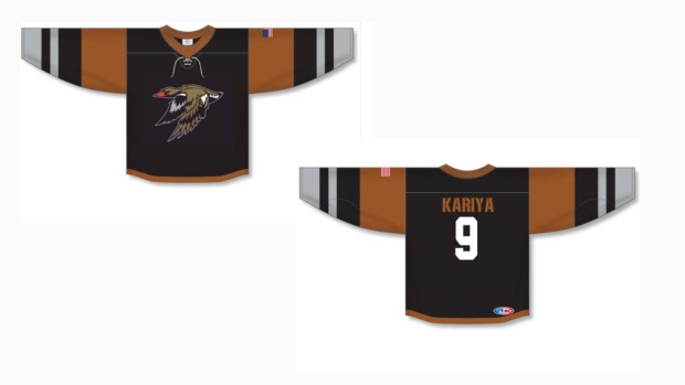
Kind of cool but also kind of ugly? We do love seeing Kariya on the back of any Ducks jersey, but preferably on one with this logo:
Speaking of concepts… a graphic designer tried to spruce up some of the ugliest third jerseys in NHL history and had some nice results. No Ducks tarp here, though.
So.. what are your thoughts on the Ducks tarp? Would you want to see them rock something like this in the future?
(H/T r/Hockey)


