
Nike... Koho... CCM... Adidas...
NHL jerseys certainly have a long and colourful history. The conversation surrounding jerseys never seems to end, with countless arguments and debates continuously bringing life to the hockey community on social media.
That's why Luca, Corwin, Jesse and DZ got together to decide what decade of NHL jerseys reigns above the rest.
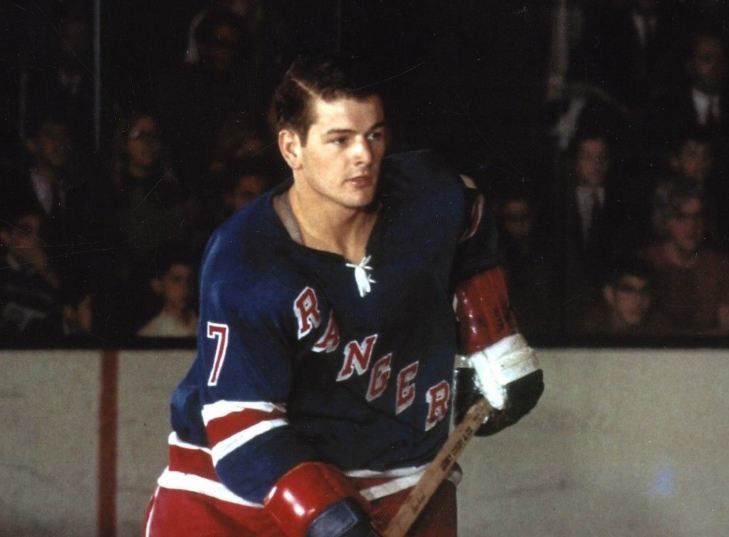
From the classic uniforms of the Montreal Canadiens and the New York Rangers all the way to the modern-day Reverse Retro lineup, looking back at hockey's jersey history will always bring an entertaining conversation, regardless of the era.
The 1960s, as DZ puts it, provided the “foundation” for everything that’s come after. A lot of hockey fans would agree that while there wasn’t necessarily a ton of experimentation (or creativity for that matter) in the 60s, the precedent that the early era set was instrumental in the jerseys we see today.
Any concept that is seen today, particularly within the Original Six, was inspired by the 60s era (and the years before) so It just wouldn’t be fair to hate on the 60s too much.
The 1970s is where things start to get a little more interesting. Gone are the days of the basic, “classic” jerseys. In its place? More teams and more hints of creativity. From the Atlanta Flames bringing in the flaming ‘A’ to the Buffalo Sabres rocking their classic dual sabre emblem, the 70s represented an era where more teams brought more ideas to the table.
But at the same time, more experimentation brought, unintentionally or not, more awful jerseys. Ironically enough, a lot of the Original Six teams ditched their classic threads and tried more logo-centric ideas.
Spoiler alert: these all failed miserably.
So while there were more teams with more experimentation, not all of the new ideas were a resounding success.
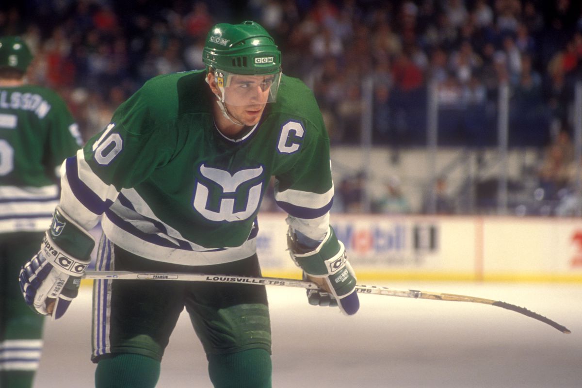
For the 1980s, hockey fans saw more of the same. The Hartford Whalers, the Minnesota North Stars and the Quebec Nordiques all brought vibrant colours and fresh logos to the scene, which, in turn, made for some of the most iconic jerseys in NHL history.
On the contrary, the Vancouver Canucks electing to go with yellow as a primary colour, and the New York Rangers choosing to write “New York” diagonally instead of “Rangers” were some of the more… disappointing decisions from that era.
So while the 80s did bring us some historic logos and jerseys, the decade wasn’t perfect. Regardless, some of the jerseys from this decade are still widely-regarded as some of the best in hockey history.
The 1990s are argued by many to be the greatest era of NHL jerseys ever. Period. Looking back at some of the best jerseys from this decade and the options themselves seem endless. The Anaheim Mighty Ducks made their debut with their iconic logo and the San Jose Sharks took the NHL by storm as an expansion team by debuting their bold shark emblem.
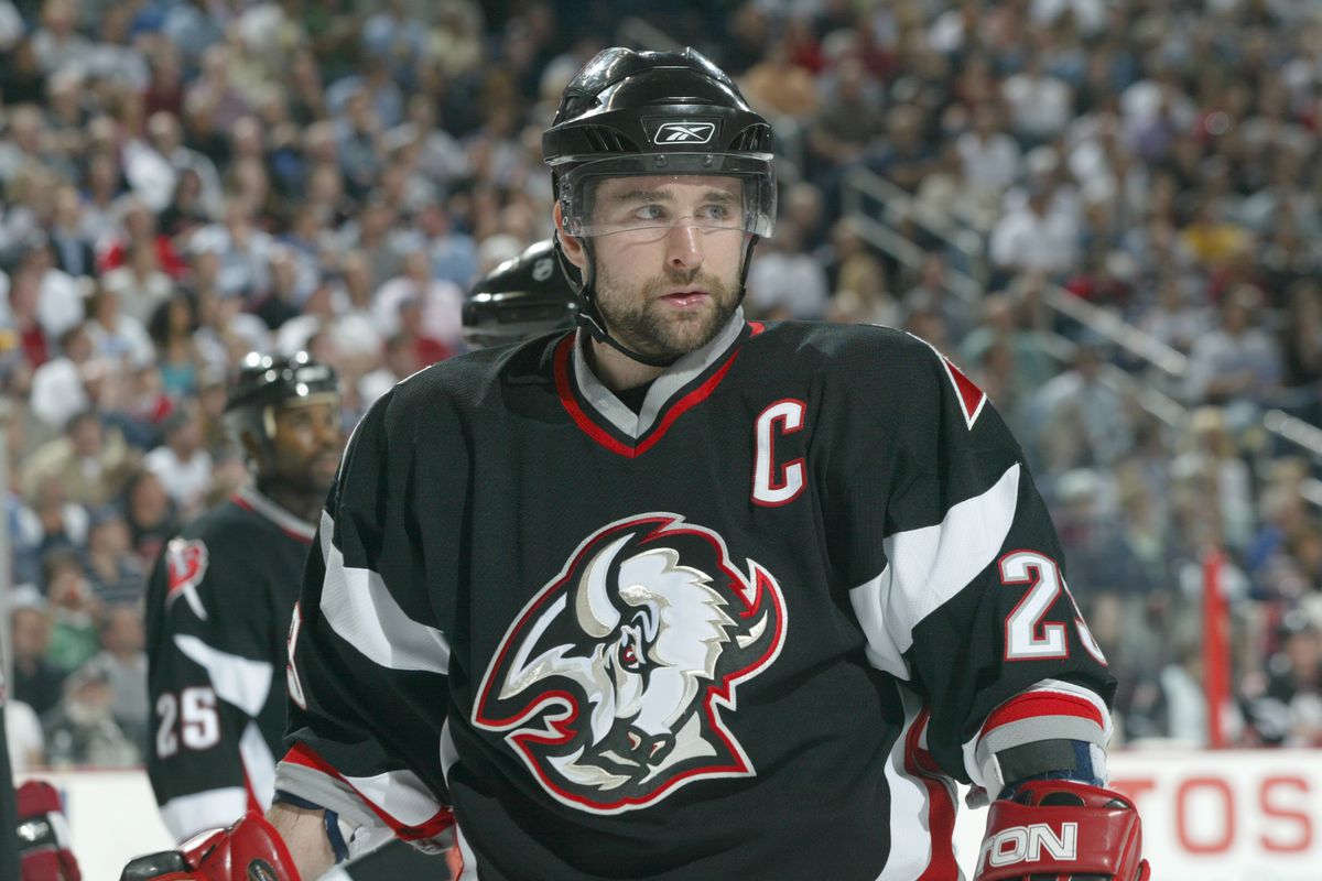
The Pittsburgh Penguins went even bolder with their emperor/robo-penguin, the New York Rangers swayed away from the norm and introduced a logo with the Statue of Liberty, and the Sabres somehow one-upped their already iconic jersey in favour of a red and black bull. Taking all of these options into consideration and it’s not hard to see why some (but not all, including certain members of the BarDown team) see the 90s as the best era of NHL jerseys.
Contrasting that, the 2000s and the 2010s are ironically argued to be among the worst decades for jerseys in hockey. Yes, the NHL introduced some fun ideas like the Stadium Series and Winter Classic, which ended up bringing an abundance of jersey options to the fold. But unfortunately, as we collectively look back on what teams were going for, a lot of those jerseys were flat out terrible.
A large majority of Stadium Series jerseys were either A) not creative enough, B) a horrendous abomination of a team’s primary jersey, or C) a mix of both.
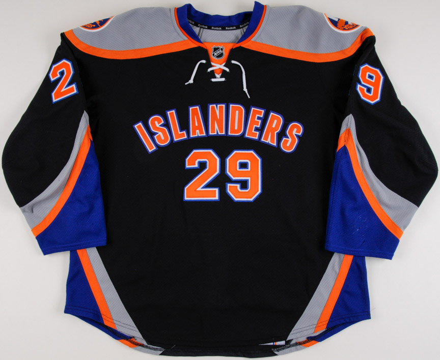
In addition, a fair amount of alternates from these two decades were also terrible. The Sabres yellow ones and the Islanders black and gray ones (the ones that look more like practice jerseys) come to mind first.
It was a tough 20 years for the NHL when it came to jerseys but thankfully, they seem to be on the right track in terms of redemption.
Which brings us to the present. The 2020s.
While we’re not even two years into the decade, the argument for this era also being among the best for jerseys has surfaced a number of times. The Reverse Retro line alone (with the Avalanche, Kings and Wild all bringing some incredible threads to the conversation) could be enough of an argument in favour of this decade.
But alas, it's too early to tell. Jumping ahead before this decade is even halfway done doesn’t do much in terms of settling any debates. Only time will tell if the 2020s are, in fact, the best decade of hockey jerseys. But that won't stop Corwin from arguing in their favour.
What is the best decade of hockey jerseys? How would you rank them? Let us know @BarDown.


