The Columbus Blue Jackets definitely spiced things up a bit with their reverse Retro jersey and while a lot of people are feeling it… some people definitely ain’t.
CBJ elected to go with red jerseys while incorporating their classic old logo (without the bug), but what if they chosen to go with their classic blue instead? u/SpolerGD did just that and honestly, we think fans might like this one more than the original November release. We’ve gotta say, the logo looks pretty killer on a modernized jersey.
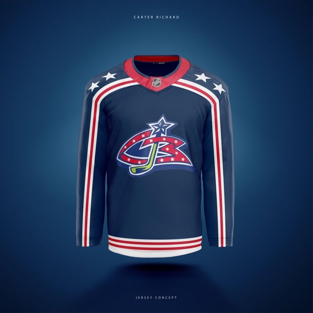
That logo is classic. And did anyone even released that it actually says ‘CB’ in it? Take a closer look in case you didn’t notice before.
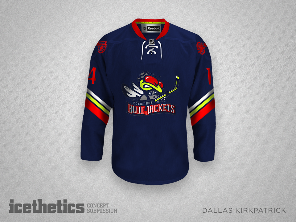
As for the original? Again, definitely a wild one.
We know the bug shoulder patch should probably be retired forever but… just imagine it on a jersey. For one game only!
So, what are you feeling more? The original or this concept?
(H/T u/SpoilerGD/r/Hockey)


